Tuesday, February 3, 2009

Week Three: Lots of dRaWiNg gOiNg oN!


above:
Leif's drawing of an egret for Sketchy's Challenge.

Alright! I'm caught up with posting your drawings. And we've got lots of them to look at this week. Everyone is showing a lot of improvement in controlling their lines and drawing accurate proportions.

This week's blog posts are divided into 4 parts. To view your drawings, you can continue scrolling all the way down this page and click 'Older Posts', or jump ahead by clicking on the following links:

1. Last Friday's lesson about patterns and texture is shown below.
2. To see Sketchy's Challenge, featuring everyone's drawing of the egret, click here.
3. To see the drawing challenge about outlines and contour lines click here.
4. To get started on this week's drawing challenge, Let's Get Abstract, click here.

I look forward to seeing who takes the abstract drawing challenge. This Friday we'll be looking at real-life branches and rocks to draw textures and begin learning about form. For info about form click here. See you Friday! --Rob

Shown below are your drawings for the Patterns and Texture lesson. If you missed class, please ask Hilda for the lesson reference pictures.

Craig


You've improved on your quick study sketches which helps you to draw correct proportions of the jaguar. You included patterns of thick lines to show the roundness of the jaguar's tail. Excellent job at including all the details of the lizard. I like the expression on its face! You included patterns for the texture of its skin and the surface the lizard is on. Check the proportions of the tail on your drawing compared to the reference picture. Your experiments with the graphite and coins is called frottage. Frottage is a way to show texture in a drawing. You can also try using this technique to show different surfaces such as rocks and wood.

Elvis


Excellent work on the jaguar. You captured the overall proportions of its body, the angle of the head, and curve of the tail. The contour lines of its body, especially its back and right leg, are well drawn. You also did a great job of drawing the details including the patterns on its body and facial features. The thick contour lines show the roundness of the tail. The proportions of the lizard are accurately drawn. You included all the details from the reference picture such as texture and facial features. The gray tones are also very accurate.

Gage


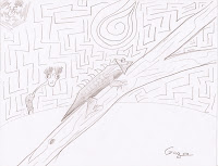
Overall, you've done a good job of drawing the proportions of the jaguar and including patterns on its body. The gray tone of the body is a natural-looking contrast to the paws and sharp claws. Check your drawing to the reference picture. Are the curves of the thick contour lines of the tail the same? I really like how you've added a branch and background pattern to your drawing of the lizard. Good job of showing the texture of the lizard's skin and the tree branch. The shading on the lizard's body shows the form of its body and brings the lizard to the foreground of your picture. Excellent composition. I've noticed that you're including a Saturn design element to your pictures. Try developing it more in this week's Let's Get Abstract drawing challenge.

Jaime


Big improvement in drawing the proportions of the jaguar and lizard! You did a great job of including all the details such as the patterns, facial features and texture. You're gaining more confidence in drawing accurate, clean outlines. Keep practicing sketching light guidelines before your final outlines. Compare your drawing to the reference picture. Do the thick curved contour lines show the roundness of the jaguar's tail?

Jared


Excellent job on drawing the proportions of the jaguar and the lizard. You've also done a very good job of adding patterns and texture to both drawings. The texture for the lizard's skin and the tree branch make your drawing interesting to look at. Compare the thick contour lines of the jaguar's tail in your drawing to the reference picture. Do the contour lines show the roundness of the tail? The cast shadow you've drawn underneath the jaguar and the background gives depth to your picture. Cool drawing style for the trees in the background of the jaguar picture. By adding the hills and trees in the background you've given your composition depth of space.

Leif


Your drawing of the jaguar shows that your ability to draw proportions has improved a lot. Controlled contour lines show the form of jaguar, especially its front right shoulder and leg. Great job of drawing the thick curved contour lines that show the roundness of the tail. Good job of adding a cast shadow under the jaguar's body. Cool how you added a magnifying glass to your lizard picture. Compare your drawing to the reference picture of the lizard. Is the body proportioned accurately, compared to the head?

Michael


Great job of including all the details of the lizard. You ability to draw outlines continues to improve. The facial features of the lizard are drawn accurately. You've done a good job of overlapping the legs over its body and the texture of the tree. Although you didn't finish the jaguar, you did a good job of drawing your guidelines before the final outlines.

Week Three: Sketchy's Challenge

It was awesome that so many of you took up the challenge to draw the egret! The background space around the egret is called negative space. The space that the egret occupies in your drawing is called positive space. Where the negative space meets the positive space shows you the edges of the bird. This is very helpful when drawing the edges of something. We'll learn more about positive and negative space in our next lessons.

Here's some info about positive and negative space: Click here

Here's the reference picture from Sketchy's Challenge so you can compare your drawing: Click here

And here are your drawings of the egret:


Craig
Overall, you captured the egret's body and curve of its neck. Great job on the facial features and showing the contrast between the shadows and highlights of the body. You've done a good job of getting the angle of the area where the legs meet the body. Check the angles and natural curves in the reference picture. How do they compare to your drawing?


Elvis
Good job of showing the proportions and overall angle of the egret's body. The angle and form of the legs are well drawn. Excellent how you included the gray tones for shadow areas and highlights. I like the way you've shown the delicate edges of the feathers on its shoulders. Compare the curve of the neck in your drawing to the reference picture. is the 's' shape the same? If you have time to do a quick study sketch of only the neck area, I'd like to see it.


Gage
Good job of capturing the overall proportions of the egret. The gray tones you've drawn show the form of its body. The contrast of the dark gray legs compared to the body helps make the bird look more realistic. Your confidence in using bold lines is showing in this drawing! Also the contour lines and angle of the legs look natural.


Jaime
You did a good job of drawing the overall form and proportions of the egret. The form of the beak looks very natural. I like how you added the feathers where the legs attach to the body. Compare your drawing to the reference picture. Does the curve of the neck look the same?


Jared
Overall, you did a good job of drawing the proportions of the egret's body and head. You did a good job of drawing the form of its head and the 's' turn of the neck. I liked how you erased highlights on the body and head. Compare your drawing to the reference picture. Is the length of the neck the same?


Leif
The background, plants in the foreground, and form of the egret make for an excellent composition. You did a great job of drawing the bird's beak, head, and 's' shape of the neck. I like the gray tones and highlights that form its body. Compare your drawing to the reference picture. Does the area where the neck joins to the body look the same? The way you've drawn the legs makes them look natural.


Michael
The control of your lines has improved a lot! Excellent job of drawing the proportions of the egret's head and body. You did a very good job of drawing the beak, eye, and curve of the neck. I like how you took the time to show the shaded tones and highlights of the body.


Ricky
Good job of drawing the overall proportions of the egret. You captured the curve of the 's' curve of the neck and the area where the neck attaches to the body. Compare your drawing to the reference picture. Are there places where the neck could be wider or narrower? Good job showing the contrast of gray tones and highlighted feathers.

It was cool that our two teachers, Hilda and Patty, joined in Sketchy's Challenge, too!


Hilda
I really like how you blended the gray tones in the background, bringing the plants and the egret to the foreground. I really like the subtle contrast of the gray tones of the bird's body with the highlights of the feathers.


Patty
Excellent contour lines that show the form of the egret, especially the head and facial features. I really like the detailed line work used for showing the feathers, eye, and beak. Also like the flowing lines you used to indicate the plant. Patty, I look forward to seeing any details that you've added to the lighthouse drawing you're working on.

Drawing Challenge: Outlines and Contour Lines

Many of you took my suggestion and while looking at Pablo Picasso's "Two Men". This was your introduction to drawing outlines and contour lines. Can you describe the difference between and outline and contour line?

Craig
Very clean outlines! The contour lines of the hat of the man standing are drawn well, particularly where the brim of the hat meets his forehead. Overall, the proportions of the two men turned out well. You did a good job of capturing their facial expressions. Check the proportions of the face of the man seated. Are they the same in your drawing compared to the reference picture? Craig's comments: "Thank you for showing me how to draw."


Elvis
The contour lines of the two men are drawn very well, particularly the vest area of the man standing and the form of the body of the man sitting. I like the contour line for the chin of the man standing. You did and excellent job of drawing accurate proportions of the men's bodies, heads, and hats. You also did a superb job of including all of the details such as buttons and facial features. Check the curved contour lines of the men's hats and the neck area of the man sitting. Elivs' comments: "Thank you for commenting on my Picasso drawing. I am trying to work better on my outlines. And I think I did good on my challenge this week."


Gage
It looks like you ran out of time on your drawing of the two men. What you've drawn shows sharp outlines and good overall proportions of the man standing. You show the curved lines of his hat and contour line for his chin. Take time to compare your drawing to the reference picture. Do your contour lines show the outside edges of the clothing? You may want to take some time to finish this drawing. Gage's comments: Thank you, I really like your class and I'm excited to come back on Friday."
Jaime
You got a good start with drawing contour lines. Looks like you needed more time to finish. The contour lines that you drew are showing the form of the man's arm and clothing. Since you started out good contour lines, you may want to take time to finish this drawing. Jaime's comments: "Rob, I like your class a lot and I think I'm going to learn a lot. Thank you."


Jared
Looks like you ran short of time while drawing the outlines of the two men. You captured the basic proportions of the man standing. His head was looking pretty good but you erased your guidelines. Keep practicing sketching the contour lines of things. If you can, take some time to finish this drawing. Jared's comments: Thank you very much for the opportunity to learn how to make beautiful artwork. I really enjoyed our last session together and am really looking forward to the next one. I hope to learn a ton from this experience and maybe make a living out of drawing."


Leif
Great job of including the details of the two men. Very good job of drawing accurate proportions of both men with clean lines. Practice taking time to draw light guidelines then carefully drawing the contour lines, like you did on the egret. This will help to make your drawing look more realistic. Leif's comments: Thank you for teaching me how to draw sea creatures 'Kenny'. Don't worry I know your name is Rob. I just feel more comfortable calling you Kenny."

Michael
Your drawing of the Egyptian hieroglyphics shows your improvement of controlling your lines. Since you're interested in hieroglyphics you may want to finish this drawing--you've got a good start! If you'd like to continue Click here. Michael's comments: "Thank you Rob for teaching me how to be a better drawer."


Shaylah
Excellent job of drawing the details of both men! You did a very good job of sketching guidelines before finishing with darker contour lines. The contour lines for the chins shows the form of their faces. The contour lines of the vest of the man standing are particularly well drawn. Also, the curved contour line, where the forehead of the man sitting meets the brim of his hat gives depth to your picture. Does the hat of the man standing show accurate curved contour lines? Your line work is improving a lot. Keep practicing drawing accurate contour lines that show the edges and roundness of things. Shaylah's comments: "Well thank you, I'm excited to learn more techniques in your class. I enjoy being in your art class."

Very good job of drawing the details of the two men. You took the time to draw accurate contour lines for the men's clothing. Your ability to draw proportions is improving with each of your drawings. Ricky's comments: "I took a lot of your advice about the shading on the crab and blowfish. I first started out drawing the shape of the blofish, then I made sure that it wasn't too dark because then it's hard to erase even though you shouldn't be erasing. Then I started to doodle more with the details of the blowfish. The way that we have to hold the pencil is different than normal. After my attempts of drawing the blowfish I started to work on my crab. But the crab is harder to draw than the fish. I really enjoyed the first class and hope to have many more classes with you teaching."

Drawing Challenge: Let's Get Abstract!

If you're ready for some sketching today, here's this week's drawing challenge:

Let's Get Abstract!
If you're up for the challenge, use the techniques you've learned during the past few weeks to create an abstract drawing. An abstract drawing doesn't represent things (people, objects, places, nature, etc.) in the real world. Instead, you're going to use combinations of lines, shapes, patterns, tones (shading), and textures to make a picture from your imagination.

Think of it as composing music. Use the repetition of lines and shapes to create rhythm in your composition on paper. Get bold with swirling movements of your arm like a conductor of an orchestra. Express your emotions and feelings through the lines that you draw.

You can use all different kinds of lines (thick, thin, curved, angled, squiggly, etc.). Try overlapping shapes. Throw in a bunch of patterns and textures to make designs. The only rule: Don't draw any people, places, or things from the real world.

left: Gage has some abstract designs in the background of last week's lesson about patterns and textures.


Here are more examples of abstract art:

Wassily Kandinsky
was the guy who created the first abstract painting, about 80 years ago. Here's some of his work: Click

Juan Miro was another big time abstract artist. Here's his work: Click

Although these artists from a group called Wee Will Doodle include things from the real world in their doodles, I think you'll get inspired by there approach to drawing. I think you'll like their drawing styles: Click (scroll down to see photos of the artists drawing)

Okay. Do some quick warm ups, then get into the "Zone" (a little music?), and start drawing an abstract composition from your imagination. And don't forget to check back here tomorrow to see your drawings and comments from last week's lesson. --Rob